ChatGPT, Gemini, Claude. Don’t believe the TYPE.


I’ll admit there are few things in life duller than file formats. If you manage a website or are a content editor, you’ve probably uploaded an image or two, expecting it to appear exactly as you intended. But WordPress has other ideas. Images are resized, compressed, and sometimes mangled beyond recognition. Understanding how this process works can save you time, and the frustration of a pixelated hero image front and centre on your homepage.

Imagine ordering a single pizza and finding out that, rather wonderfully, your kitchen has automatically divided it into different slice sizes for kids, adults, and your very hungry mate Dave. That’s essentially what WordPress does with your images.
When you upload a single image, WordPress doesn’t just leave it be. It automatically generates multiple versions at different sizes. Something along these lines:
The result? Your website loads the right image size based on the visitor’s device, meaning your site doesn’t grind to a halt under the weight of enormous photos. Clever stuff. The original image you uploaded? It’s just sitting in your media library, never actually used unless explicitly requested.
WordPress does its best to shrink image file sizes down to keep things snappy. This is useful, but let’s not pretend it’s perfect. Sometimes the compression is barely noticeable, like the difference between full-fat and semi-skimmed milk. Other times, it’s as if someone’s taken a blurry photocopy of the Mona Lisa.
If you want to ensure your images stay crisp while being lightweight, tools like Squoosh are a lifesaver. They let you tweak the quality so you don’t end up with a Picasso-esque version of your CEO on the About Us page.
Here’s something that confuses many: We have changed WordPress to follow a 2:1 pixel density ratio. This means an image at 1200px wide will display in a 600px-wide box—it uses double the amount of pixels to ensure images look sharp on high-resolution screens. If you’re wondering why, well, blame Apple and their Retina displays for setting that expectation.
Right, let’s break it down in plain English.
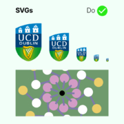
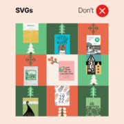
✅ Best for: Logos, icons, and anything made of simple shapes and colours.
🚫 Avoid for: Anything with a photograph in it. You cannot, despite what some believe, convert a blurry photo of important stakeholders gathering around a foamex cutout into a razor-sharp SVG masterpiece.
✅ Best for: Most images, especially photographs. It’s like JPEG but smaller and better.
🚫 Avoid for: Super simple graphics (SVG is better).
✅ Best for: High-quality images with even better compression than WEBP, reducing file sizes while maintaining crisp detail.
🚫 Not for: If you’re still using Internet Explorer AVIF images won’t display properly.
✅ Best for: Images that need a transparent background, like logos.
🚫 Avoid for: Huge photos unless you want your site to load at the speed of a dial-up connection.
✅ Best for: Detailed images and photographs. Decent quality, decent file size.
🚫 Avoid for: Anything needing transparency. JPEG doesn’t do see-through.
Let’s be blunt: never upload a 5000px-wide image unless you enjoy making your visitors wait while their internet groans under the weight. WordPress will resize it anyway, so stick to sensible limits:
If your image is already smaller than 2800px, don’t try to enlarge it like a dodgy CSI ‘enhance’ scene. It won’t end well.
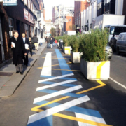
Ever uploaded an image that looked perfect on your laptop, only to find it’s been cropped weirdly on mobile? That’s because different screen sizes can change the way images appear.
✅ Keep images under 200KB where possible.
✅ Use Squoosh or other compression tools before uploading.
✅ Avoid using WordPress to resize images — do it beforehand.
✅ If compression destroys quality and you’re getting pixelisation, upload a sensible-sized image (under 1MB) and let WordPress do its thing.
Most people ignore these, but they matter.
Look, uploading images isn’t the most thrilling task in the world, but do it properly and your website will thank you. Get the right file type, size them correctly, compress them sensibly, and always check how they look across different devices. Otherwise, you might just end up with a homepage full of blurry, stretched-out disasters — and nobody wants that.