Chester Beatty Museum
Crafting a distinct identity, signage, and website for one of Ireland’s greatest museums.
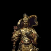
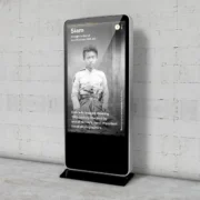
Part of the Sacred Traditions exhibition in the museum.
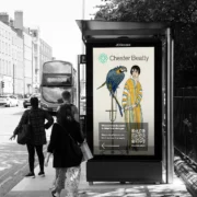
The Chester Beatty (Previously the Chester Beatty Library) is a museum that contains treasures from the great cultures and religions of the world. It’s a place where cultures engage through art, a chance to explore new worlds. Our first action was to lose the word Library; it’s not simply a library; it’s much more.
Creating the Identity
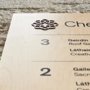
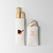
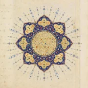
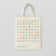
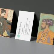
The collection encompasses many traditions, including Ethiopian, Southeast Asian, Middle Eastern, Japanese, and European Orthodox. Despite their diversity, these traditions have a common historical thread: they were passed down through generations from master to apprentice. This heritage played a key role in shaping the new identity. Through our analysis of the collection, we discovered recurring geometric shapes evident in feudal Japanese art, Islamic mosaics, and Coptic designs, which inspired the design of their new logo.
Website
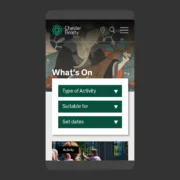
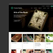
Our brief was to build a beautiful, welcoming, informative and accessible website. Workshops with staff and end users helped us define what the site needed to do for visitors and the museum. We worked with the museum’s in-house photography department to create images that would work particularly well for the website.
Usability was fundamental to the success of this project. It’s designed with the end user in mind right from the beginning, offering a seamless experience for viewing upcoming events, booking tickets, and becoming a member of the Chester Beatty, all within a single platform.
Ultimately, the website reflected the stunning collection; it reduced clutter and prioritised key content.
Visit chesterbeatty.ie
Wayfinding & Signage
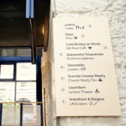
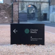
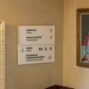
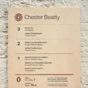
We designed the wayfinding system to integrate seamlessly with the building’s architecture.
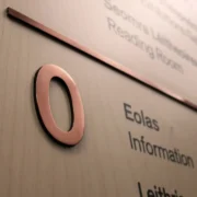
The museum’s wayfinding and signage are crafted from wood and copper, explicitly chosen to pay tribute to Chester Beatty’s successful career in copper mining, where he amassed his wealth.
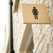
We created a small set of icons to ensure consistency across various platforms. We use these icons consistently across the wayfinding system, in print materials and on the website. The primary focus of the wayfinding design is to enhance the user experience. For instance, we strategically placed signs to extend from walls and at corners, ensuring they are apparent and easily accessible to all visitors.
