The National Archives
Building a brand for the home of Ireland’s written records
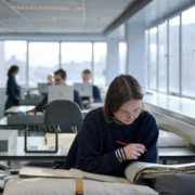
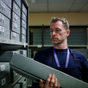
The National Archives exists to preserve the memory of the state and to hold Ireland’s public records so that everyone has access to them as a resource. They are responsible for safeguarding the documentary heritage of Ireland.
They wanted to transform into a more outward looking institution and enhance its engagement and perception with the general public. In an ongoing relationship we have collaborated with them across several key areas which includes book design, brand identity, exhibition design, social media and signage and environmental graphics.
The Treaty 1921: Records from the Archives
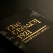
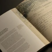
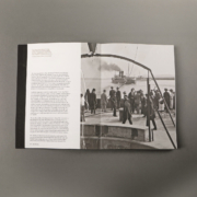
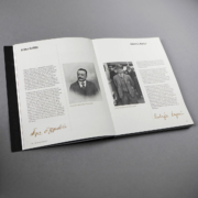
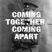
The National Archives asked us to create a book that would encapsulate the tension and drama surrounding one of the most pivotal moments in Irish history—the signing of the Anglo-Irish Treaty of 1921. The National Archives needed this book to do more than just present historical documents; it needed to tell the story of the Treaty negotiations in a way that was both visually compelling and deeply informative.
We designed the book to emphasise the gravitas of the period, using a layout that juxtaposes everyday ephemera—like ticket stubs and dinner menus—against critical government memos and drafts. This approach brought the personalities of the delegates to life and provided a fresh historical perspective.
We collaborated with the National Print Museum in creating the artwork for the cover. It draws inspiration from the Dáil Éireann letterhead, using Gaelic letterpress type.
Promotional Campaign
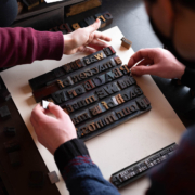
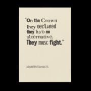
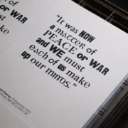
To promote the book launch, we extended the visual narrative of The Treaty 1921 into a series of limited-edition letterpress posters. Working with Mary Plunkett and the National Print Museum, we selected key quotes from the book to create a set of three posters, each featuring a different quote from the leaders of the Irish and British delegations, as well as a quote reflecting the delegates’ personalities.
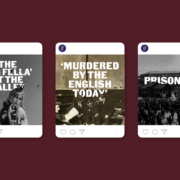
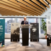
Each word and phrase were carefully set to highlight the significance of the text. The posters were unified through a consistent design that emphasised their historical roots while maintaining a modern edge. The process was documented and shared on social media, generating buzz and anticipation for the book’s release. Additionally, we designed totems featuring posters quotes, which were displayed alongside guest speakers at the launch event.
Days in the Life: Reading the Michael Collins Diaries 1918–1922
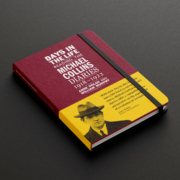
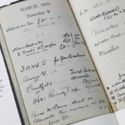
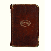
Continuing our partnership with the National Archives, we were tasked with designing a book around the working diaries of Michael Collins — a central figure in the struggle for Irish independence. This book needed to capture the essence of Collins’ frenetic life, from his daily tasks to his critical role in the independence movement.
We approached the design with a focus on authenticity and historical accuracy. The book’s structure, centred on 20 essays, was interspersed with diary pages reproduced at their actual size.
On an Equal Footing With All
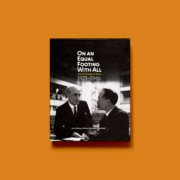
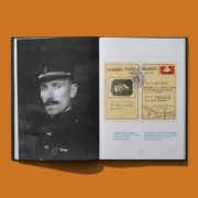
This is a story about how the fledgling Irish state took it’s place amongst the global community, The League of Nations. In September 1923 Ireland joined the League of Nations: the global organisation created after World War One to oversee international security and disarmament, which was the forerunner of the United Nations.
This book explores and evaluates the 23 years of Ireland’s membership of the League, up to its dissolution in 1946, using a chronological and thematic approach. It is illustrated with more than 80 images, including documents, photographs and ephemera, taken from the National Archives and other collections.
Sustainable Exhibition Design
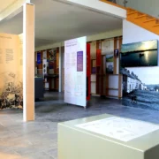
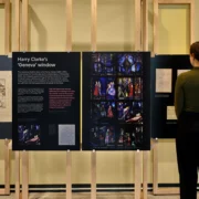
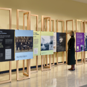
Part of this project also incorporated an exhibition design commemorating 100 years since Ireland joined the League of Nations. This project, which marked Ireland’s emergence on the global stage, required a design that was both sustainable and versatile, as the exhibition would be displayed in multiple venues, including Dublin, Geneva, and the United Nations in New York.
Working with John McLaughlin Architects, we developed a highly sustainable and modular exhibition design. The framework was crafted from oak, designed to be freestanding, robust, and reusable, with removable connections between modules. This allowed the exhibition to adapt to different spaces while maintaining a cohesive look. The graphic design elements were printed on highly recyclable honeycomb boards, produced locally to reduce the carbon footprint.
Read more about sustainable exhibition design in Diarmuid’s journal post Sustainability in Exhibition Design: Much to consider
An ongoing relationship
Our partnership with the National Archives has resulted in a series of projects that not only modernised the institution’s visual identity but also told a story that leaves a lasting impression with the public.
Our work with the National Archives has proven that thoughtful design can bridge the past and present, making history accessible and engaging for modern audiences.
The success of our projects with the National Archives underscores our commitment to excellence in design, from concept to execution. If you’re looking for a design partner who can help you navigate complex projects while delivering exceptional results, we would love to hear from you.
