RockX
Brand identity for a service-driven construction company that is transforming the industry.
RockX supplies, hires, repairs, and refurbishes excavator attachments across Ireland and the UK. In a market dominated by engineering-led brands with minimal visual distinction, RockX needed an identity that projected strength, precision, and reliability.
Excavator attachments are tools of controlled force. They break rock, fragment concrete and carve through earth, shaping form by removing material with accuracy and intent. This subtractive process sits at the heart of the industry. RockX required a brand that expressed this fundamental principle while building credibility and functioning seamlessly across real-world applications, from equipment markings to workshop signage.
The Solution
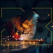
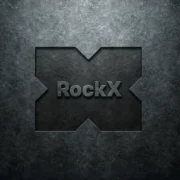
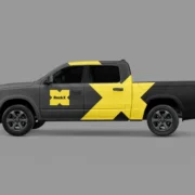
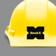
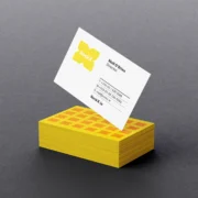
The identity is built around a bold, elemental symbol: an X carved from a solid block. Starting with a rectangular block, the most stable and familiar form in construction, four triangular cuts are removed from its sides, revealing the X within. This mark embodies the same disciplined subtraction that defines excavation: shape created by removal.
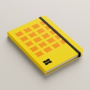
A robust industrial palette, construction yellow and orange, steel grey and deep black anchors the brand in the environments where RockX operates. The symbol’s angular geometry and substantial weight ensure clarity in tough conditions: coated in dust, worn through use, or viewed from a distance on heavy machinery.
The Outcome
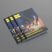
The RockX identity elevates the business from a parts supplier to a strategic force within Ireland’s construction sector. It reflects the core values that define the company and the equipment they service: strength, precision, and dependability.
The carved X delivers immediate recognition and conveys exactly what RockX does: refine, repair and restore heavy equipment through controlled, expert force. The result is a brand built to endure: confident, purposeful and unmistakably tied to the realities of construction.
Other Projects

Linn Dara
Public art commission for Linn Dara Mental Health Facility for Children and Young People.
- Signage & Environmental Graphics
Údarás na Gaeltachta
An identity that pays homage to Gaeltacht heritage in a contemporary way.
- Book Design
- Brand Identity
- Digital / Website Design
- Signage & Environmental Graphics