Cló Gaelach and The Story of Us


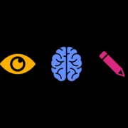
We think Inclusive Design is about making things that work for everyone, no matter who they are or what they can do.
Three terms come up whenever people discuss it: accessible design, universal design and human-centred design. They overlap, they’re easy to confuse, and each has its own history, methods and best use. Furthermore, they are in constant evolution 🤯.
Knowing how they differ (currently) helps us choose the right focus for each project.
Accessible design makes things usable by people with disabilities. It grew alongside the disability rights movement in the USA and the understanding that most barriers are created by design, not by people’s bodies.
It works to defined standards. For example, the Web Content Accessibility Guidelines (WCAG) for websites and building regulations for physical spaces. Having set standards allows accessibility to be (somewhat) easily assessed.
Accessibility is the baseline; it is the minimum everyone is entitled to, and the thing we should never fall below. It’s best built in from the start, though in practice it’s often retrofitted.


In practice:
Where it might fall short: When treated as a checklist, accessibility can end up bolted on rather than built in, meeting the letter of the rules without ever asking whether the thing is actually good to use.
Universal design tries to create a single experience that as many people as possible can access and use. It sticks to one solution that works for everyone without needing add-ons or special versions.
There are seven principles of Universal Design:
In practice: Automatic doors help wheelchair users, parents with buggies and delivery workers alike. Lever handles suit almost any grip and beat round knobs for people with arthritis, full hands or limited strength. Clear, consistent signage helps tourists, people with cognitive differences and anyone finding their way somewhere new.
Where it might fall short: Universal design enforces a single design solution without the need for adaptations or specialised design; it can produce a compromise that suits no one especially well.
Human-centred design is a mindset rather than a checklist. Different organisations have different principles for their approach, but we will go with the brilliant design thinker Don Normans: focus on people: find the real problem; and think in systems.
When we refer to people in HCD, we don’t mean just the so called end-user. It means thinking about all the people in the system. It doesn’t begin with a rulebook, but with research into real people, real tasks and real situations, and keeps testing the work against them as it goes.
understand the context, work out what people need, design something, test it with real users, and go round again until it works.
Human-centered design video by IDEO
Key characteristics:
In practice: Watching how people really do a task before you redesign it, instead of guessing. Talking to and observing users. Building rough prototypes to test ideas early. Running sessions to see what actually works. In accessibility, it’s why we bring Disabled people into the process from the start, as collaborators rather than as a final check. Their lived experience is real expertise, and it shows up barriers that no checklist or assumption ever would.
Where it might fall short: Human-Centred Design is only as good as the people in the room. If your research misses whole groups, you can build something that works well for the few you spoke to and quietly shuts out everyone else. Without accessibility standards as a backstop, Disabled users can be left out simply because they weren’t part of the process. It also takes time and money to do properly, which can tempt teams to rush the research, the very thing that makes it work.
Each of these fields has its merits. To some degree they are merging, and for good reason: their weak spots line up with each other’s strengths. A human-centred process only helps the people you actually bring in, so if your research misses a group, accessible standards are the safety net that still covers them. And that same process does something the standards can’t: it stops them becoming a box-ticking exercise, and stops universal design settling for a bland compromise that suits no one. Put them together and they go further than any one does alone.
Even so, the balance shifts from project to project. A public-sector website leans on standards and the law. An exhibition or wayfinding scheme leans on universal thinking. A complex product leans on a human-centred process. Good design isn’t about choosing one and ignoring the rest. It’s about understanding each project, getting the mix right, and involving Disabled people in the work rather than designing on their behalf.
Whatever the mix, the goal is the same: work that includes people rather than leaving them out. Everyone has a right to access, and designing for that usually makes things better for all of us. That’s why we believe accessible design is better design.